The value of typography in creating your brand
By Jadah Smith
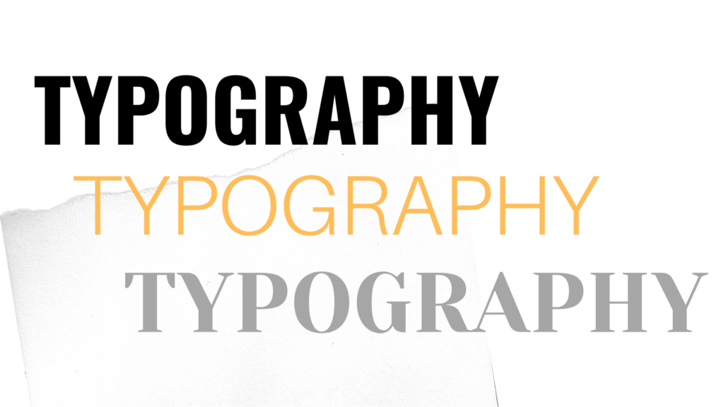
Typography is a key component in the overall look of a design. Learn how to choose the best typeface for your next project, ensuring it conveys the desired idea and emotion to your audience.
Typography, what is it?
Typography is the organization and styling of a group of letters.
Effective typography:
- Legible
- Emotional
- Purposeful.
It’s used everywhere, from your books to restaurant menus, to convey a given message. When picking the right typeface (font family) for your brand, consider the impact you want to have on your audience when they’re reading or interacting with your design.
Why is it important?
Typography is a key component of design, especially when it comes to branding. Typography is a crucial element of visual identity, being the closest-related graphic element to the brand’s message.
It is also a way to connect the brand to the consumer, creating interest and engagement with a brand’s content. Not only can typography be a fun way to express the tone of the brand, but it is also a component of brand identity that can be easily used across different platforms.
As mentioned by small business consultant and designer Anne Carton, “Typography is a way to use text as a visual to convey a brand message.”
Typography transforms the tone and personality of a brand; it literally translates your message in a powerful, visual way. When considering how to implement a typeface into your design, use your brand’s visual identity as a foundation.
A visual identity refers to how the branding materials – design elements and colors – come together to build an image of a brand. This is achieved through repetition and consistency; it ensures brand recognition when done well.
How is typography used?
To master typography for your brand, understanding visual hierarchy is essential. According to Interaction Design Foundation, visual hierarchy “is the principle of arranging elements to show their order of importance.”
The strategic organization of design elements and information impacts the audience’s perception.

Visual hierarchy is based upon:
Style – When planning the overall look of a design, considering textures and patterns is essential. Eye-popping textures and patterns can really make something stand out.
Size – When considering size, the bigger the size of the text the more likely it is to draw the eye.
Color – Color combinations play a big role in conveying emotion and bringing attention to one text over another. It is important to consider colors that provide a balance between contrast and legibility.
Alignment – When considering the layout, alignment is what draws the eye to one area of the design over another. Consistent spacing is crucial to your design, ensuring legibility for your audience.
Consistency – Maintaining consistency in design and brand identity increases brand recognition. When the audience can recognize the brand by its different components effortlessly, you know the design consistency is working.
Whitespace – Whitespace focuses the eye in on one item in particular. By adding more whitespace, designers can generate more attention for specific elements in the text or graphic.
Typography can be a simple and effective way for you to communicate your brand with your audience. At 1893 Brand Studio we strive to help our clients from brainstorming concepts to implementation of design. Contact us to learn more about incorporating typography in your own brand.