
By: Anne Claire Foreman
Why it matters
Designing online graphics for your company can seem like an overwhelming and tedious task. Picking a suitable color scheme is one of the most important details in a design.
Often overlooked, color is a crucial tool that can be leveraged to impact customer perception and mood when viewing graphics. Research shows it takes only 90 seconds for a person to make a subconscious judgment about a product, and around 70 percent of that assessment is based on color.
Next time you’re staring at a blank page on Adobe Illustrator or Canva and wondering which colors to use, check out our tips on how color can draw customers to your designs.
The basics
Red:
Red is associated with passionate, strong or aggressive feelings, so it is important to use it sparingly.
Because red is often associated with stoplights and warning labels, it can also imply danger. Lighter reds are great to accentuate elements of a design in small proportions, while a darker red can add power.

Coca-Cola utilizes a bold red to add power and a cursive white font to bring sophistication to its infamous logo. Fun fact: it is estimated that around 94 percent of the world’s population can recognize Coke’s red and white logo.
Orange:
Orange can bring a sense of happiness or excitement to a design. Similar to red, it should be used sparingly because it’s a strong color on the eye.
However, it is best to use orange for a call to action in a design because it commands viewers’ attention without coming across as aggressively as red.
Yellow:
Yellow is universally known as the color of happiness and sunshine. Yellow can foster a feeling of inspiration and confidence in viewers, but too much can bring negative reactions.
When using yellow, especially when paired with white, it is important to make sure your design is digitally accessible to viewers with vision impairments.
Green:
Green is the color of nature, which means it signifies balance and harmony. It is a calming color that can show growth and progress. Green is great in designs related to nature, but it is important to consider that it can also be connected to materialism.

Starbucks uses its logo to appeal to the harmony and materialism associated with green. The logo expresses richness and a sense of welcoming, just like their coffee.
Blue:
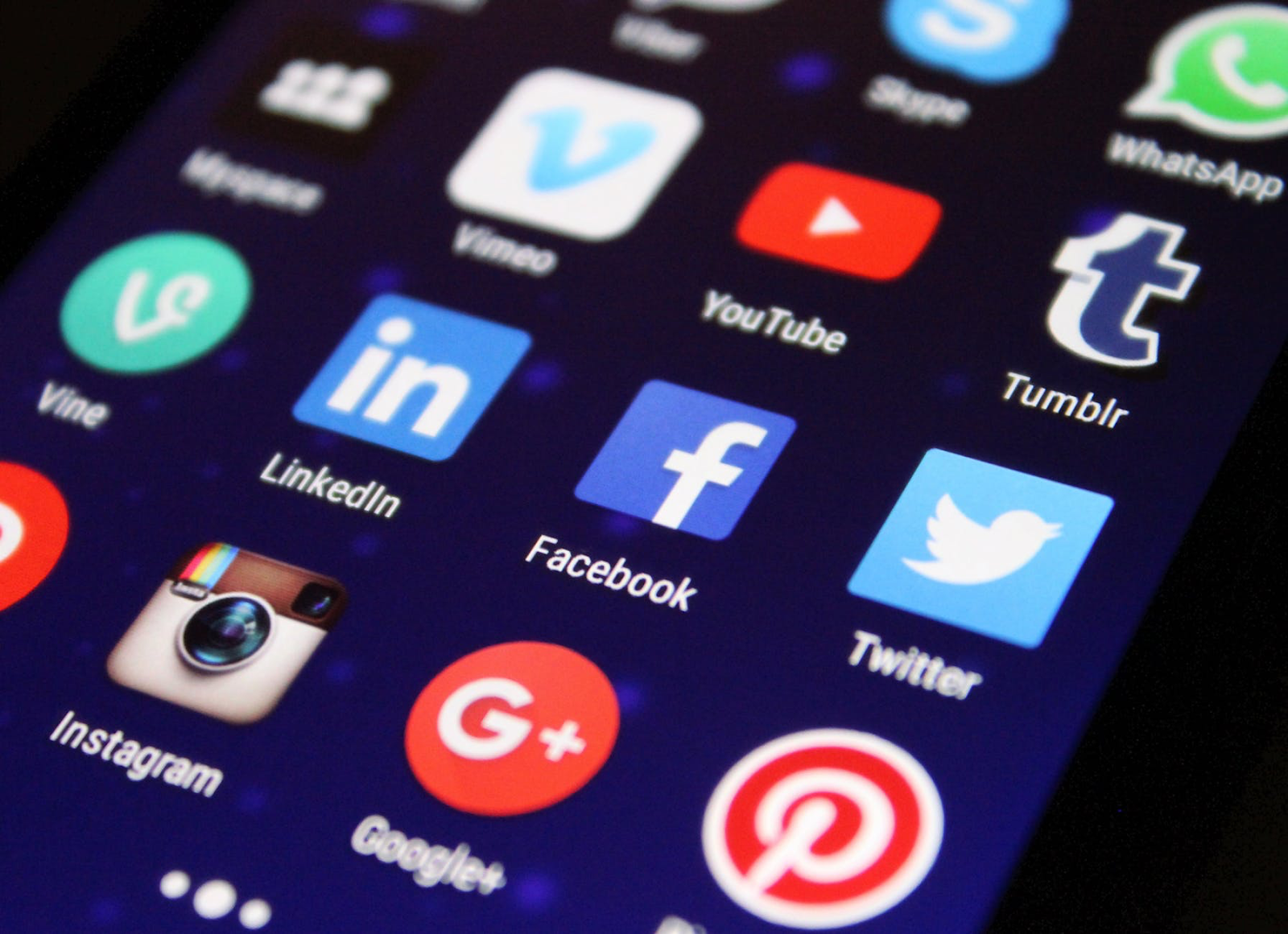
There’s a reason Facebook and Twitter have made use of blue as central to their graphic design. Darker blue is tied to corporations because it’s the color of trust. If you operate in the healthcare sector, lighter blues are often tied to cleanliness. Too much blue can also seem sad or distant, so make sure to keep your use in balance.

Samsung uses dark blue to portray that even though it’s a big tech company, it deserves your trust. Contrastingly, toothpaste brand Oral-B utilizes light blue as a color of calmness and cleanliness.
Purple:
Purple has long been associated with royalty and wealth, so it can be great for luxurious products. It is a color of mystery and magic, but because it is not as commonly used, too much may distract from the message you’re trying to convey with your design.
Pink:
Heavily associated with love and romance, hot pink can convey a sense of playfulness while lighter pinks can communicate tenderness.
Don’t consider pink and red as interchangeable for graphics revolving around love – red is more associated with passion while pink can represent romance or charm.
Brown:
Brown is a color of security and protection, often associated with stability and the planet. If you’re looking for a background color to bring a sense of warmth or comfort to your design, brown is a great pick.
Black:
Black can take on a plethora of meanings, some of which include grief, modernity, mystery or seriousness.
Interplaying black and light colors can create a stunning contrast in designs, and the dominant color can add a sleek look. Black can also overpower other colored elements, leading to them being ignored by viewers.
White:
For centuries, the color white has been associated with purity and cleanliness. Additionally, white can signify possibility, nothingness and sophistication.
Many designers agree that white is great for neutral backdrops, but it can also be used as a statement color. In addition to layering white text on top of dark backgrounds, leaving room for white space (areas of a design without any text or graphics) can be striking.
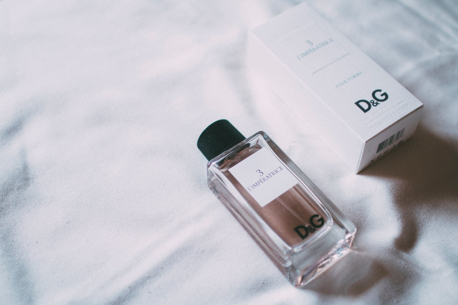
Many beauty companies use white packaging to convey that the products are sophisticated and classic.
How 1893 Brand Studio Can Help
If you still have questions, our graphic design team can help you perfect your projects. We offer services for logo design and redesigning, rebranding, and creating marketing materials. For more information, click here
If you are interested in making your company’s designs more digitally accessible, the UNC Digital Accessibility Office has some great online resources, including three checkers you can use to make sure your color contrast is up to par.